
_edited_edited_edited.jpg)
Project in Practice
This section focuses on the translation of research into creative output. It documents how theoretical insights and conceptual ideas were transformed into a critical website and an immersive audio installation, outlining the key design decisions, drafts, and creative strategies that shaped the final outcome.
FIRST CREATIVE IDEA

This sketch shows my first attempt to turn the research into an experience. The initial idea was to create a choice-based interaction where the audience could engage with two paths: “I feel safe” and “I plan my route.” This was meant to show how safety is not the same for everyone, but something that is often planned and managed. This idea was directly informed by my research into how women’s safety is not equally experienced, but constantly managed through precautionary actions. However, the idea ended up being quite confusing and not easy to understand in the way I intended. Feedback from both classmates and professors showed that it felt too direct and simplified, reducing a complex issue to just two options. There was also a risk that it could become more like a simulation, trying to recreate the experience instead of making people reflect on it.
VR EXPERIENCE
One of the key elements of my initial exhibition idea was the use of a VR headset to create an immersive experience. I first explored this through sketches and interface mock-ups, where the viewer would be placed inside a scenario and asked to respond to situations, such as hearing footsteps behind them. The interaction was designed around simple choices, allowing the user to decide how to react in real time. The aim was to translate the research into a more embodied experience, where the viewer would not just observe but actively engage with different moments of uncertainty. I focused on structuring the experience through decision points, text prompts, and pacing, trying to create a sense of tension and awareness through the interaction.


Right 2 Roam


The concept of the immersive experience was influenced by Right 2 Roam, a critical board game that exposes inequalities in safety and movement through rules, probability, and imbalance. What I found particularly interesting was how the game does not offer equal conditions to all players, but instead makes visible how safety is unevenly distributed. This inspired me to think about the VR experience as a structured system, where choices exist but outcomes are not neutral or fair. I wanted to reflect how safety is often shaped by external conditions rather than personal control, and how decision-making is influenced by constant risk assessment. This led me to design an interaction based on constraint, repetition, and limited control, rather than freedom or exploration.
Spatial
To better understand how immersion could be created, I explored existing virtual environments on the platform Spatial. I looked at different types of spaces, such as open urban tunnels and enclosed environments, focusing on how scale, lighting, and layout could affect the user’s emotional response. These examples helped me reflect on how spatial design can create tension, disorientation, or isolation. I was interested in how empty environments can make the user feel uneasy, even without explicit narrative elements. However, I also realised that these spaces often felt too generic and not specific enough to communicate the message of my project, as they lacked a clear connection to the lived experience I was trying to explore.


After the January Crits, I reconsidered the use of VR and explored an alternative approach inspired by Hito Steyerl’s Factory of the Sun. Instead of isolating the viewer through a headset, I started to think about how immersion could be created through projection and spatial experience. Steyerl’s work influenced this shift by showing how video, light, and environment can work together to create an immersive and critical space without relying on individual devices. As the picture illustrates, this led me to experiment with the idea of projecting moving London urban scenario scenes onto a wall, allowing the audience to remain physically present within the exhibition while still experiencing a strong visual and atmospheric impact.
Despite the initial development, I decided not to include the VR experience in the final exhibition. One of the main issues was that the interaction started to feel too close to a game structure. This risked reducing a complex and sensitive topic into a sequence of actions, making the experience feel more like a simulation rather than critical reflection. Moreover, the use of a VR headset also introduced technical limitations, including accessibility issues and the need for specific equipment. For these reasons, I chose to move away from the VR approach and focus on alternative forms of immersion that would better support critical reflection and audience engagement.
POSTERS
January Crits Posters


The January posters marked the first visual translation of my research into design. I focused on replicating the structure and tone of institutional safety language through a system-based, code-like aesthetic. The layouts were minimal and controlled, using black and white to reinforce a sense of neutrality and authority. Phrases were presented as institutional instructions, reflecting how safety is often framed as a set of behaviours to follow. These posters helped me test how this type of language could appear inside the exhibition, almost like rules, prompts, or internal thoughts guiding the viewer. However, at this stage, the posters mirrored institutional language but did not yet strongly challenge it.
February Crits Posters
In February, the posters evolved into a more direct and critical form. Based on feedback, I started pushing the visuals further by introducing red as a key element of interruption. The red lines and highlights cut through the text, breaking the sense of neutrality and making the message feel more urgent and exposed. The language also became more confrontational, with questions such as “Who is responsible?” and “Why do we accept this?”, shifting the focus from passive instructions to critical reflection. This stage marked an important shift in my project, where the work moved from only reproducing institutional language to actively challenging it, both visually and conceptually.


Typography and visual language


The typography was intentionally minimal, rigid, and system-like, drawing from interfaces, command lines, and official documentation formats. This choice was made to reflect the “neutral” and authoritative tone often used by institutions when communicating safety advice. The structured layout, use of hierarchy, and spacing were designed to resemble instructions, reinforcing the idea that these messages operate as behavioural scripts. At the same time, I used subtle disruptions within the text, such as fragmented words, incomplete phrases, or inserted questions, to break this sense of neutrality.
Although the posters were a key part of the development process, I ultimately decided not to include them in the final exhibition. While I was working on them, I realised that they were not fully convincing in communicating the level of critique I wanted to achieve. As highlighted during feedback sessions, the sarcasm I was trying to communicate through the posters was not always immediately clear, which made the message harder to understand and reduced its impact. Instead of provoking reflection, there was a risk that the work could be misinterpreted or not fully grasped.


Concept
Typography and Visual Language
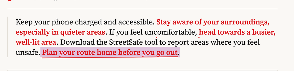
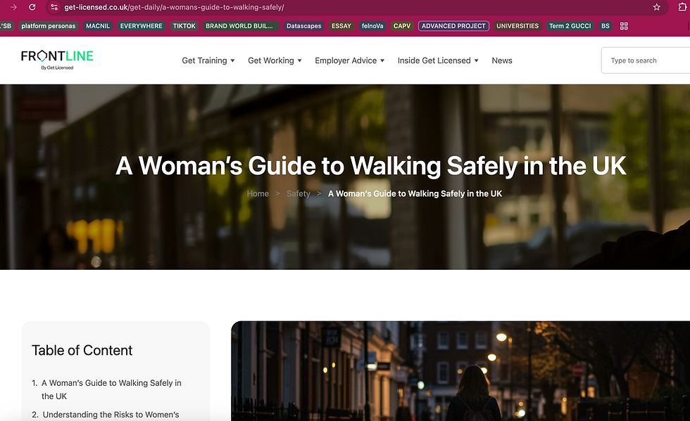
The website REDLINE developed from my poster experiments, where I first introduced the red line as a visual interruption. While creating those posters, I became more interested in how institutional safety language could be highlighted and questioned through design. At the same time, I was collecting many examples from sources like government, police, and transport websites. At first, I only intended to use the website as a personal archive to organise this material. However, after feedback from tutors and peers, I realised it could become something more. I was encouraged to develop it into a key part of my final exhibition, turning it into an interactive platform. The website evolved from a simple collection of references into a critical tool that allows users to explore and recognise patterns in institutional language themselves.

The visual language of the website was designed to reflect the tone of institutional communication. I used a minimal and structured aesthetic, with a clean sans-serif typeface to create a sense of neutrality, clarity, and authority. This approach builds on the visuals of the posters, where I first experimented with a minimal style and a system-like layout. The website translates that same aesthetic into a digital format, maintaining the use of clear hierarchy, controlled spacing, and direct language to replicate the tone of institutional communication. The use of red plays a central role in the design. Inspired by the poster experiments, the red line acts as a visual interruption, highlighting specific words and exposing the hidden assumptions within the text. Rather than being decorative, it functions as a critical tool, guiding the viewer’s attention and breaking the apparent neutrality of the language.


SECTIONS AND FEATURES
Navigation Bar

At the top of the interface, the navigation bar (Home, Evidence, About, Submit) reinforces a familiar and institutional structure, mirroring official websites. This was intentional, as I wanted the user to initially feel they are navigating a legitimate information system before gradually recognising its critical intent.
Homepage


The homepage opens with a large statement: “Safety advice often reads like a checklist for women, not accountability for institutions.” I designed this as an entry point that immediately frames the argument.
Specific words, such as “women,” are highlighted in red, directly connecting to the visual language developed in my earlier poster experiments. This creates an immediate tension between neutrality and critique.
Below this, two call-to-action buttons: “Browse Evidence” and “Add a Source”, introduce the dual function of the website as an archive and as a participatory platform.
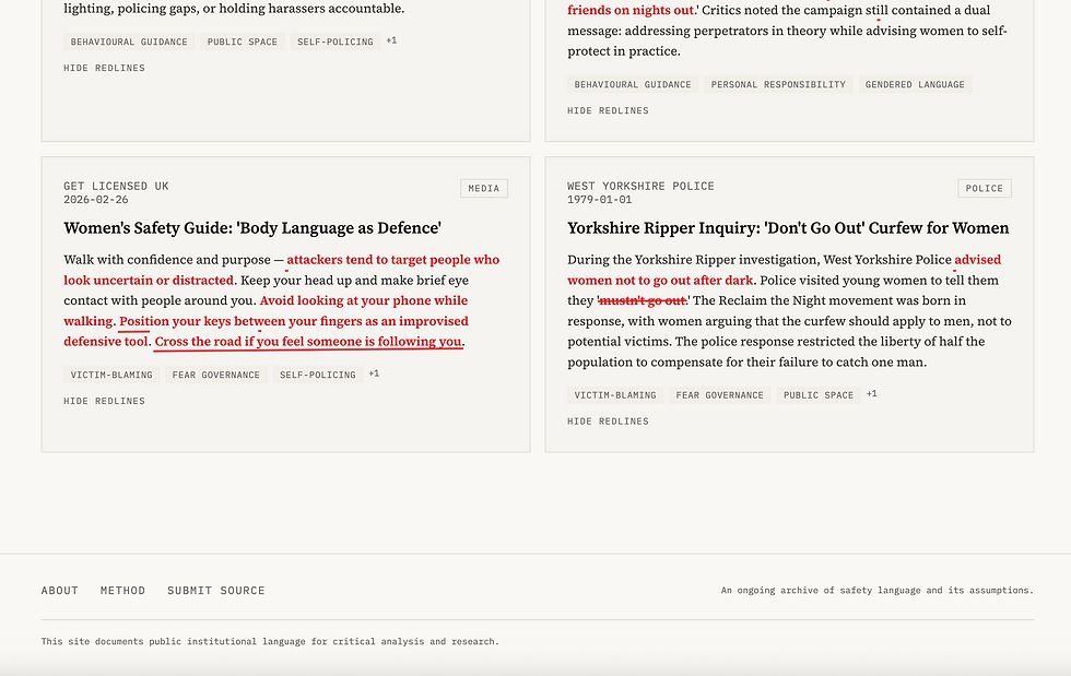
Evidence Library
The Evidence Library acts as the core of the website. Each entry is presented as a card, including the institution, date, category (e.g., police, transport), and a title such as “Walking Alone at Night” or “Late Night Bus Safety.” I chose this format to resemble official documentation or reports, reinforcing credibility while allowing easy comparison between sources.
Systemic Language Patterns
Above this, I introduced the “Systemic Language Patterns” section, which highlights recurring words such as “avoid,” “don’t,” “stay aware,” and “always.” By assigning numbers to these terms, I translated qualitative research into a data-driven visual layer, making patterns immediately visible.
Moving Red Line

Across the homepage, a moving red line of safety advice scrolls horizontally, displaying real advice from institutional sources. I added this element to simulate the constant and repetitive exposure to safety instructions. The movement transforms static advice into a continuous flow, reinforcing how these messages are embedded into everyday life.


Filters + Search system
I implemented a search bar and filtering system, including:
-
Organisation filters (police, transport, government, university, etc.)
-
Topic filters (night travel, dating, harassment, reporting, etc.)
-
Tag filters (e.g., behavioural guidance, victim-blaming, surveillance, personal responsibility)
I added this filters to allow users to uncover patterns rather than passively consume content. For example, selecting “personal responsibility” reveals how widespread this framing is across different institutions.
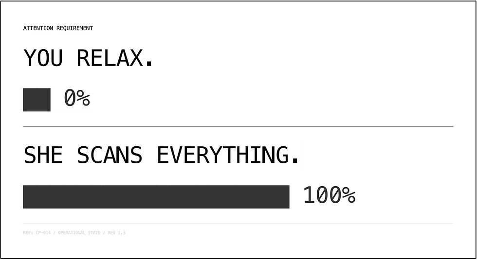
“What this implies” and Responsibility Score
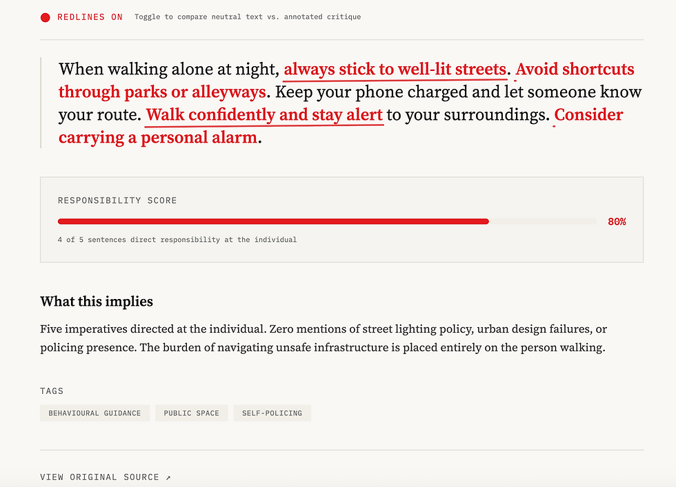

I also included a “Responsibility Score”, which quantifies how much of the text places responsibility on the individual (e.g., “4 out of 4 sentences direct responsibility at the individual”).
Below this, the “What this implies” section provides a short interpretative statement. Instead of long explanations, I kept this concise to maintain the tone of institutional reporting while subtly exposing what is missing.
Submit a Source
The Submit section introduces a participatory element, allowing users to contribute new examples. I included fields such as organisation name, source URL, excerpt, and date to maintain consistency and credibility.
PROCESS DEVELOPMENT
The development of the website began with an initial phase of visual and structural research. I explored a range of existing websites. I was especially drawn to interfaces characterised by a clean, minimal aesthetic, with white backgrounds, structured grid systems, and restrained use of colour. Following this, I translated these observations into early visual ideas through hand-drawn sketches in my sketchbook. This stage was essential in defining the core structure of the website, including the arrangement of sections, the idea of an evidence library, the use of filters and categorisation, and the integration of visual elements such as the red annotation line and responsibility indicators.


Once I established a clearer direction, I moved to digital prototyping using Lovable, where I designed the layout and overall structure of the website.
I defined a grid-based system, a clear navigation bar, and the organisation of sections such as Home, Evidence, About, and Submit. The minimal visual approach was maintained here, with a predominantly white interface, black typography, and limited use of colour, ensuring consistency between concept and design.

After defining the structure, the process shifted towards content development and analysis. I began systematically collecting and reviewing material from institutional sources such as police websites, government guidance, transport authorities, and universities. Rather than simply uploading this content, I carefully selected excerpts, edited them, and analysed the language used, focusing on recurring patterns, tone, and forms of instruction.
This stage involved manual work, including reading through articles, extracting relevant sections, categorising them, and assigning tags such as behavioural guidance, personal responsibility, or surveillance solutionism.
At the same time, I refined the red annotation system, deciding which words or phrases to highlight, underline, or strike through.


MONOLOGUE

Concept
The monologue developed from feedback received during a tutorial, where my supervisor suggested exploring a more immersive and emotionally engaging approach. This led me to focus on representing the internal thoughts of women when they feel unsafe in public space. Rather than relying on visual elements, I used the monologue to capture a continuous stream of decisions, doubts, and self-instructions. This approach allowed me to translate my research into an embodied experience, making visible a mental process that is often hidden and encouraging a more empathetic understanding of women’s everyday experiences.
The development of the monologue was strongly influenced by The Missing Voice by Janet Cardiff, in which she guides the listener through a city using a recorded voice that blends narration, memory, and environmental sound, creating an intimate and immersive experience. What I found very interesting was the way the voice she uses feels internal, as if it is part of the listener’s own thoughts, and how sound is used to blur the boundary between reality and perception. This influenced my decision to use headphones and to construct the monologue as a stream of consciousness rather than a traditional narrative.

WRITING PROCESS


The first version of the monologue followed a linear structure, describing a woman walking alone at night and navigating a situation of uncertainty. The language focused on short, fragmented sentences such as “Keep walking,” “Don’t look,” “Phone,” and “Just get to the light,” reflecting the constant decision-making process involved in managing safety. However, this version felt too controlled and not very realistic. Since I recorded it as a reading of the script, it lacked variation in tone, rhythm, and atmosphere, making the experience feel more like a narration rather than an internal thought process. The absence of sound design also reduced
the sense of immersion, limiting the emotional impact of the piece. During the March crits my professors suggested making the monologue more believable by slowing down the pacing, and emphasising the tension. The idea of pushing the tone towards something closer to a subtle “horror” experience was introduced, in order to better communicate the constant sense of alertness and unease.
Following the feedback from the March crits, I developed a second version of the monologue focusing on making the experience more realistic and immersive. Instead of simply reading the script, I re-recorded the voice with a slower pace, introducing pauses, deeper breathing, and a more anxious tone. In this version, I also introduced sound design to enhance the atmosphere. Using Adobe Premiere Pro, I layered different audio elements such as footsteps, traffic, distant voices, and environmental city sounds. However, during the tutorial, feedback highlighted that some of these sounds felt too artificial and staged. My supervisor suggested recording the monologue outdoors, in a real environment, to capture more authentic ambient sounds and improve the overall sense of realism.

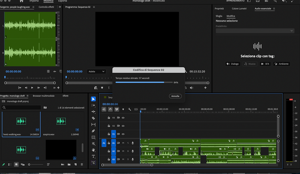
Final piece with other voices
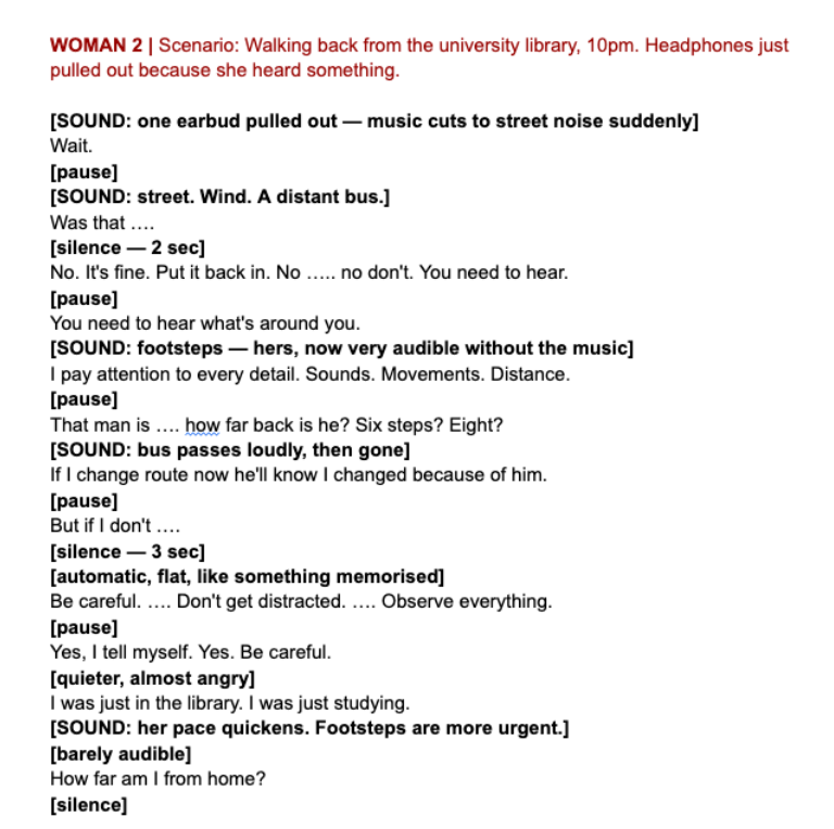


I further developed the monologue by shifting from a single narrative voice to a series of multiple voices, as suggested by my supervisor. Instead of representing one generic experience, I created five short monologues, each based on different real-life scenarios collected through my Microsoft Forms research. These included situations such as walking home after a night out, leaving the university library at night, being alone in a parking lot, or travelling on public transport. Each script represents a different woman and a different context, but they all share similar patterns of thought. Rather than relying on constructed sound design, I also recorded the monologues outside, in real environments. This allowed me to capture natural ambient sounds such as footsteps, traffic, wind, and distant voices, making the audio feel more authentic and less staged. The versions included in this portfolio represent an advanced stage of development, but are not yet the final versions. They will be further refined for the exhibition, particularly in terms of recording quality, pacing, and overall sound realism.
Tone
Language
The tone of the monologue was intentionally developed to reflect a state of continuous alertness and anxiety. Rather than sounding like a narrative or a story, the voice is fragmented, repetitive, and unstable, mirroring the way thoughts occur in real time when women feel unsafe. Short sentences such as “don’t look,” “keep walking,” and “just get there” function as internal commands, revealing how behaviour is constantly self-regulated.
Structure
The structure follows a stream-of-consciousness approach, where thoughts overlap, interrupt each other, and shift quickly between rationalisation and fear. Moments of doubt, such as “maybe I’m being dramatic” or “maybe it’s nothing,” are immediately followed by precautionary actions, highlighting the tension between trying to appear calm and anticipating potential risk. This creates a rhythm that moves between control and uncertainty.
Across the different voices, I tried to add similar phrases, reinforcing the idea that these thoughts are not individual, but shared. These monologues reflect how institutional safety advice becomes internalised, transforming external instructions into an internal voice that guides behaviour. The language operates both as personal thought and as a reflection of broader systems of responsibility (that I show in the website). Silences, pauses, and changes in volume also play a structural role. This use of rhythm and interruption contributes to creating an immersive and psychologically driven experience, where the audience is not simply listening, but actively feeling the uncertainty and pressure embedded within these situations.
SPATIAL LAYOUT

In this mock-up, I designed the exhibition as a dark space where each element reflects the visual language developed throughout the project. I chose the black wall to create intensity and a sense of discomfort, and communicate the seriousness of the issue.
Above, there is a sentence taken from my institutional website, crossed by the red line.
At the centre, there are red headphones, which act as the main interaction point. Through them, visitors listen to the monologues, creating a more personal and intimate experience.
Below, there is the website, presented in a much lighter and cleaner way. I did this intentionally to create a contrast with the rest of the space.
At first, it appears calm and reassuring, similar to official safety advice, but as the user engages with it, a more critical message starts to emerge.
There is also lighting coming from below, which helps create shadows and adds to the atmosphere of tension and unease. However, this is still a mock-up, and certain elements will be further refined and improved during the installation process.